
Consular Gateway
Consular Gateway is a redesigned website for a High Commission: the office that looks after a country’s citizens abroad and handles passports, visas and official documents.
- Service design, architecture and full-stack engineering
- Applicants and High Commission staff
- Complete, hosted as a demonstration
Status: Complete, hosted as a demonstration
- Service design
- architecture
- full-stack engineering
- Applicants
- High Commission staff
- Next.js
- React
- TypeScript
- PostgreSQL
- Drizzle
- Zod

01
Overview
It is for two groups: people who need a service and want to get it right first time, and the staff who keep the information accurate.
Visitors find the service they need, see exactly which documents to bring and what it costs, and can send a question or request an appointment, in English or French. Behind the site, staff change content through a review-and-approve process, so a fee or an opening time is corrected once and is right everywhere. It was designed for the Cameroon High Commission in the United Kingdom as part of a bid, and is shown here as a demonstration.
02
The problem
A consular website fails people when the same fee, document list or opening hours appear on several pages and disagree. Applicants travel, queue and are turned away for a document nobody told them about, and staff cannot correct a fact once without hunting for its copies.

03
What it does
One product, 4 views over the same records. Pick one to see the screen it lives in.
Office status, notices and every service
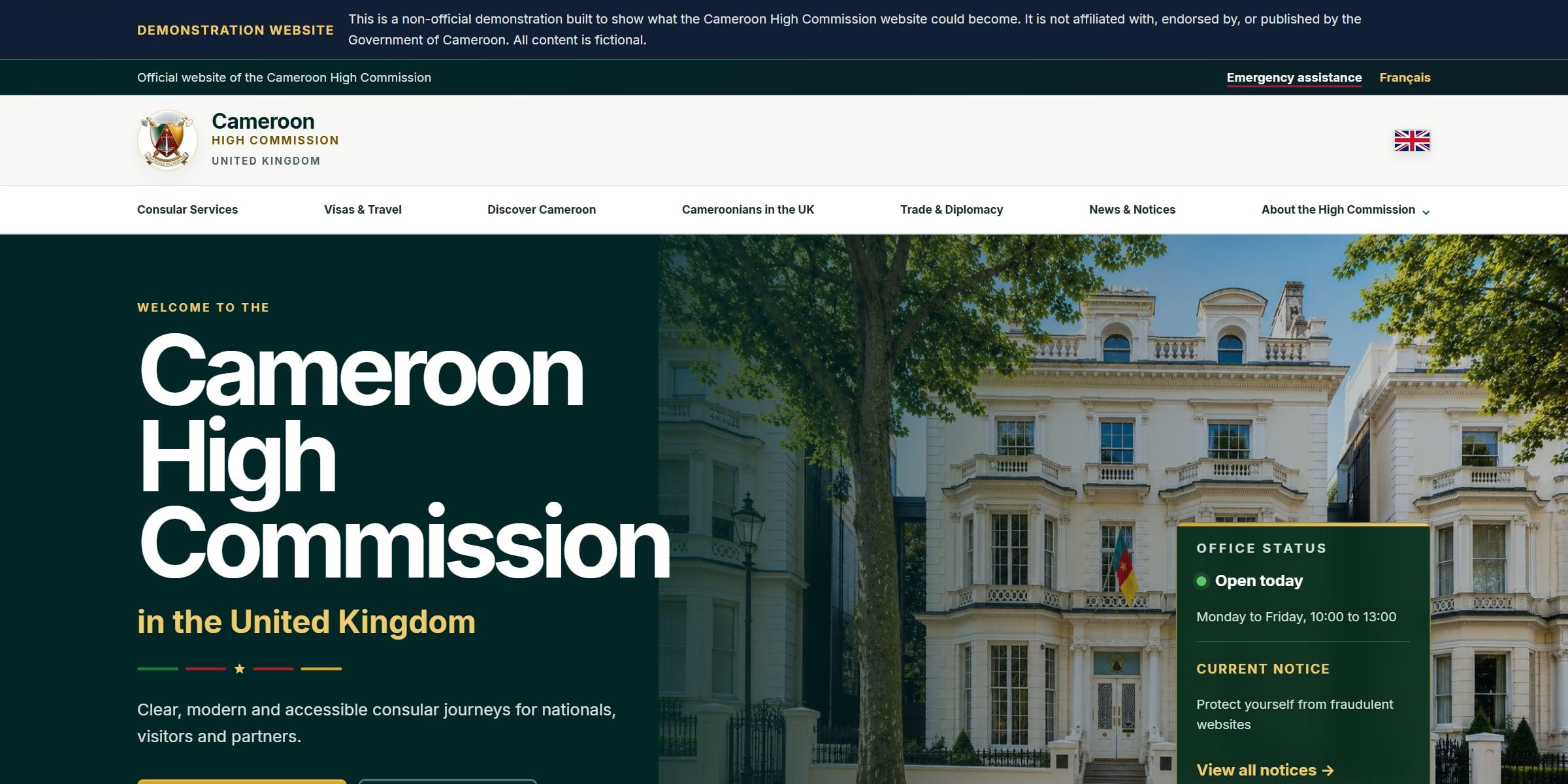
Honest by design
A banner on every page says this is a demonstration, not the official site.
Tasks, not news
The navigation leads with services, where the old site led with news.
Status at a glance
Opening hours and the current notice sit on the first screen.
More screens
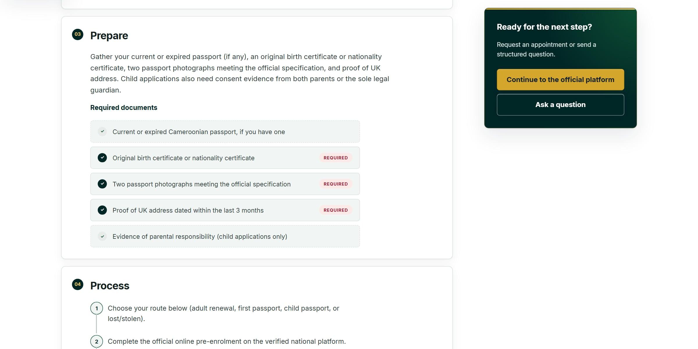
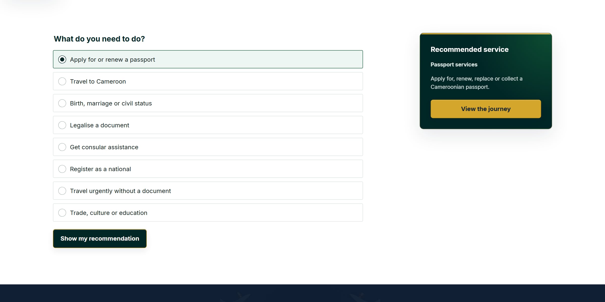
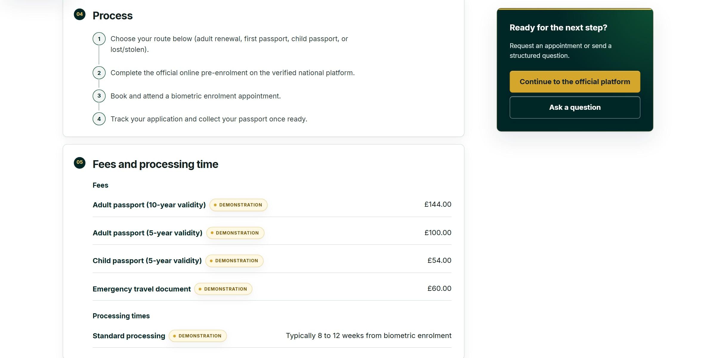
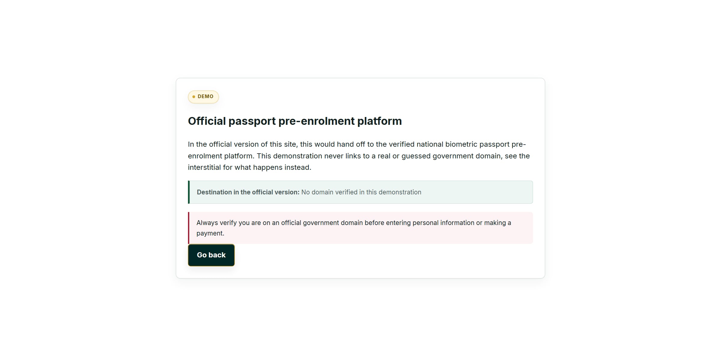
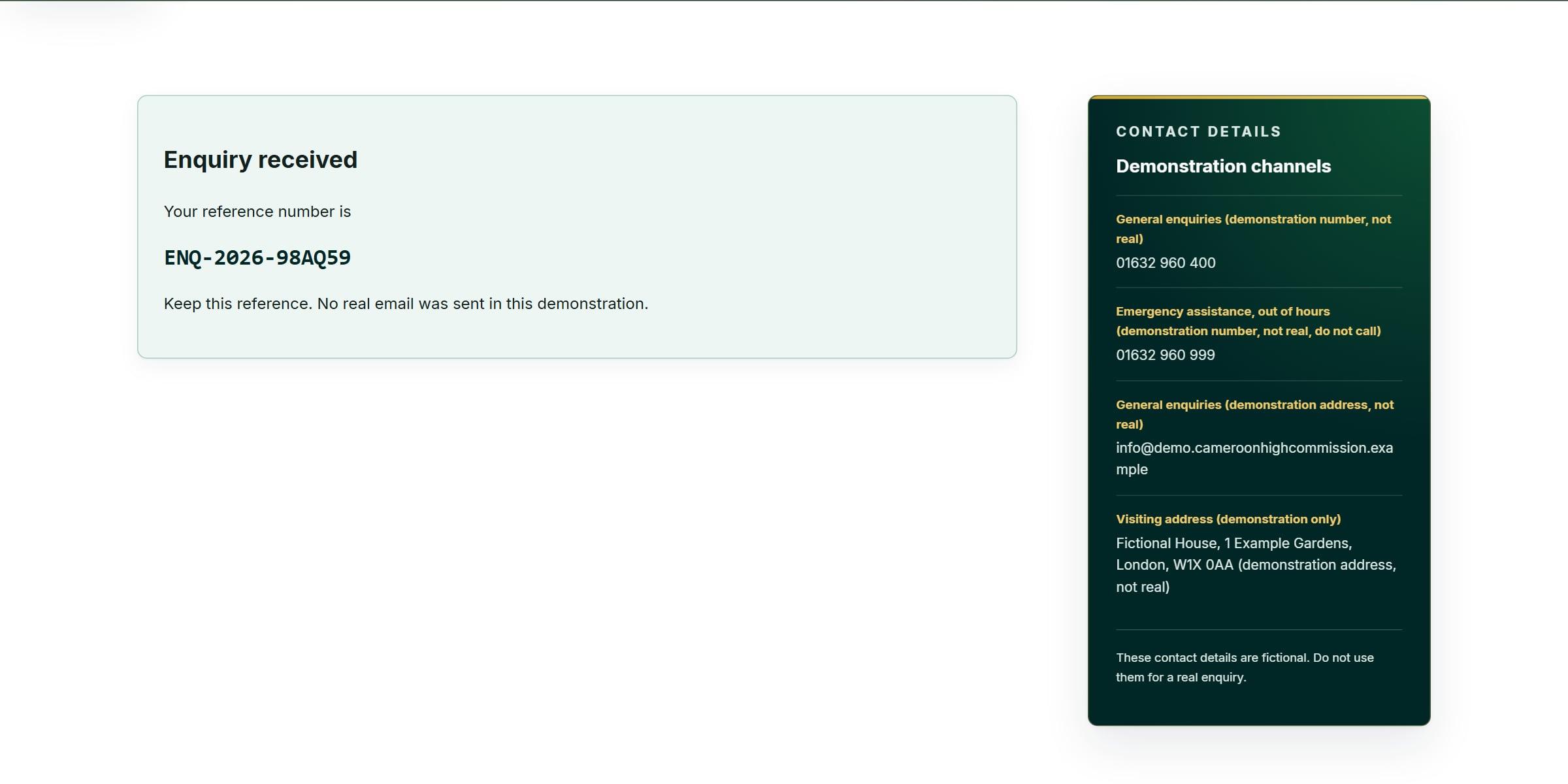
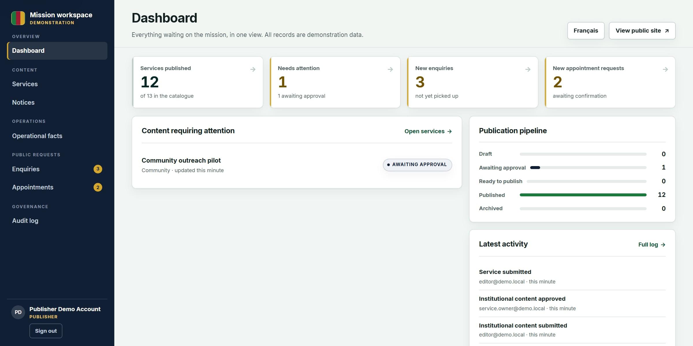
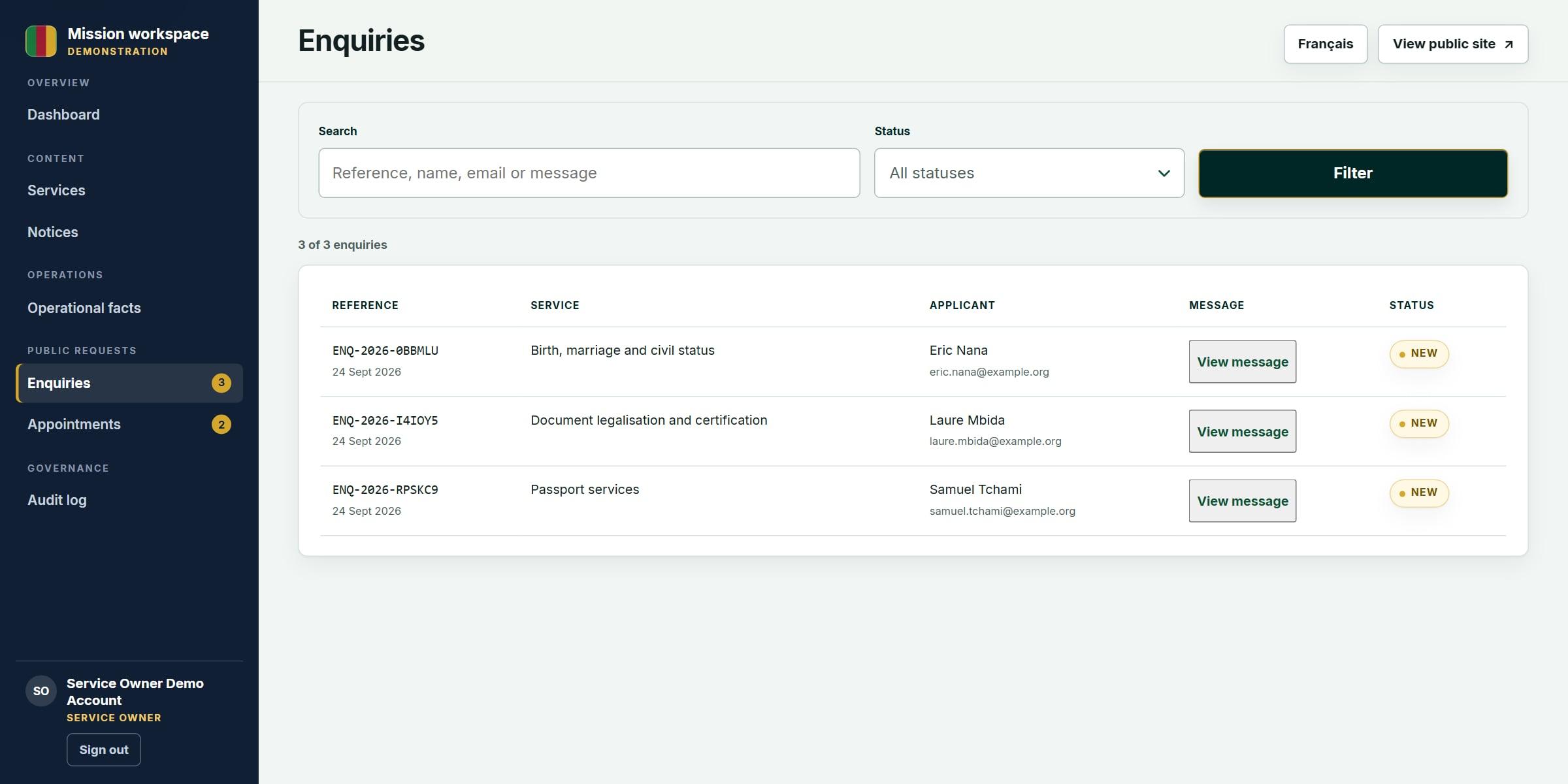
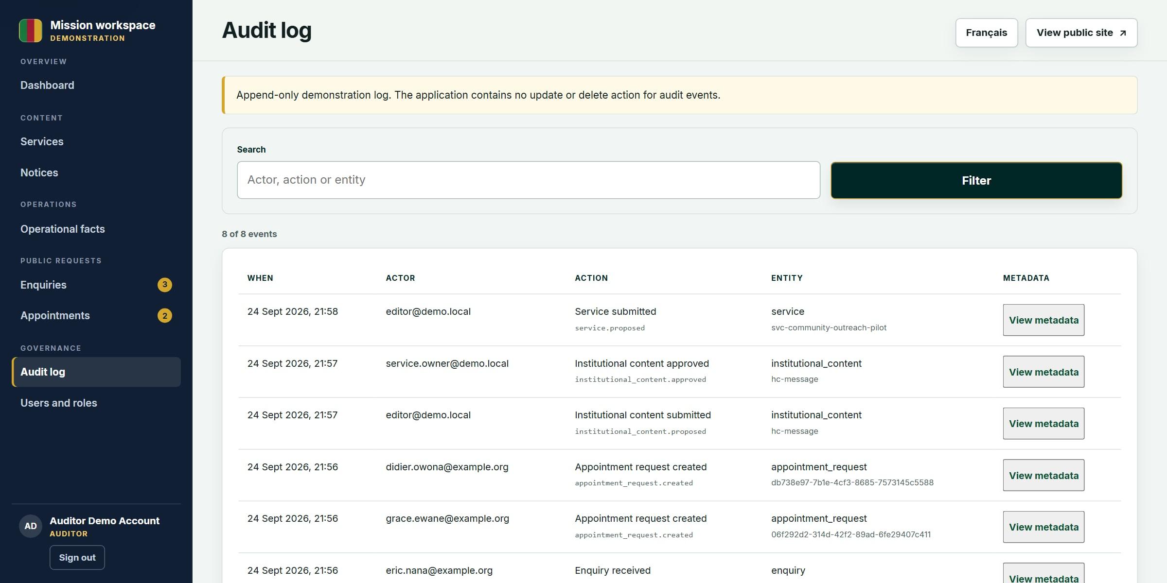
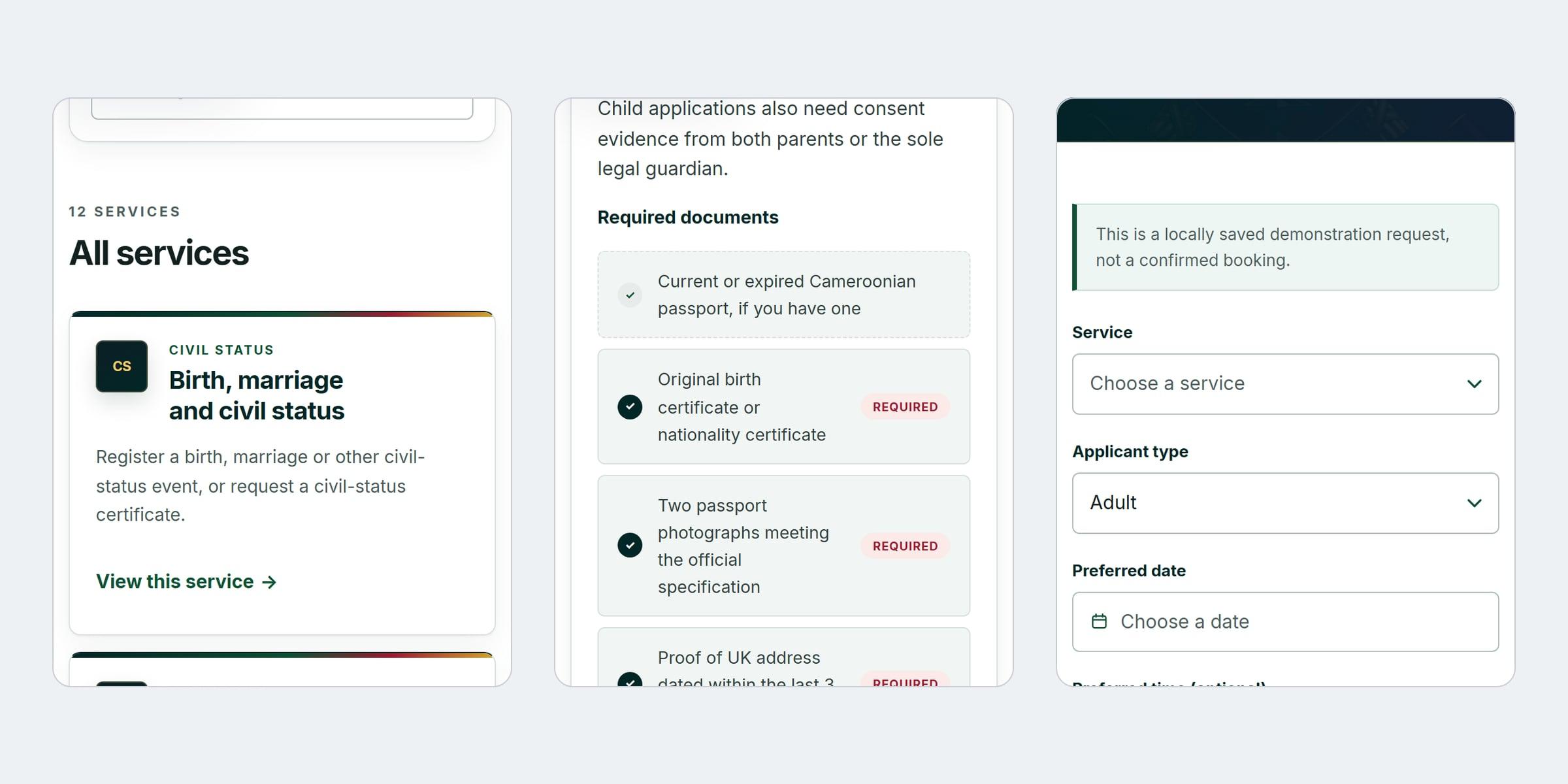
The home page: office status, the current notice and a clear way into every service
01 of 10
04
How it was designed
I designed this alone for a bid, starting from a review of the existing official website: news before tasks, notices years out of date, and fees that contradicted each other. A static prototype and a visual identity came first and were approved, then the real bilingual application was built on that direction.
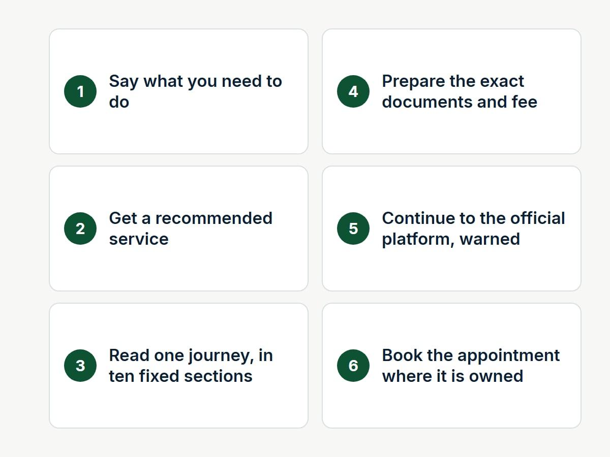
Flows
The service finder: from not knowing what you need to the right journey.
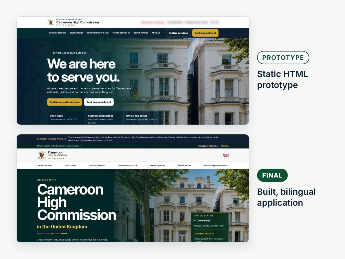
Prototype to final
The first static prototype, and the application it became.
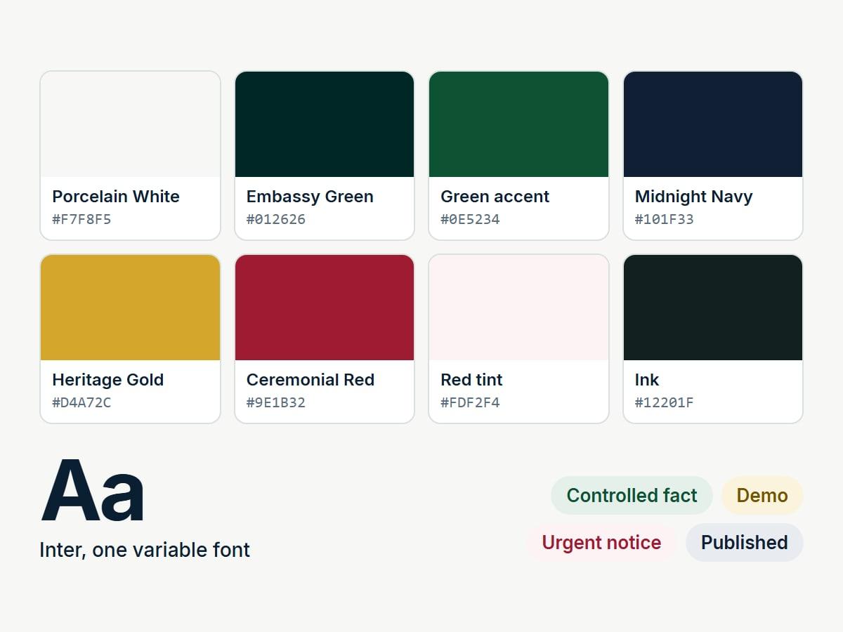
Design system
Embassy Green leads, with red and gold sharing second place.
05
Decisions worth explaining
- 01
One fact, one place
Fees, contacts, hours and external links are structured records, entered once and rendered everywhere they appear, each labelled with where it came from.
- 02
Separation of duties in the server
Every action checks the role, and whoever submits content cannot approve it. Approved and published records are immutable: changing one starts a new version.
- 03
Hand off, never impersonate
Passports and visas belong to national platforms, so the site explains and hands off. In this demonstrator every hand-off lands on an interstitial, never a real or guessed government domain.
- 04
Fail closed before collecting data
A public build saves nothing until someone accountable approves collection and retention, and a release that would persist submissions or present itself as official refuses to run.
06
Where it got to
The site is complete: a bilingual public website, a guided service finder, working enquiry and appointment forms, and a staff workspace with a full record of every change. It passes 219 automated checks, including accessibility in both languages, and runs as a public demonstration.
- 219
- automated checks, all passing
- 2
- languages, English and French
- 6
- staff roles, from editor to auditor
The boundary
What this does not claim
- It is not an official website. It was built for a bid that was not won, and is not endorsed by the High Commission.
- Every consular fact, fee, contact and member of staff in it is fictional, and the coat of arms is an approximation.
- No real applicant has used it.